Lean UX Canvas
One of the most useful things I’ve learned in product is that it;s not always yes/no; not every strong opinion needs to be either accepted or resisted outright. Sometimes what’s really needed is to faciliate a space to explore the opinion safely — to understand what’s behind it, and whether it holds up when you bring it closer to users and outcomes.
This came up recently at Sciety, a platform I work on with eLife that supports the peer evaluation of preprints. One of our stakeholders raised a concern: that the site was too focused on readers and individual curators, and didn’t speak clearly enough to groups — communities, journals, or societies that evaluate and curate preprints. They were advocating for a full UX and design overhaul to reposition the product.
This wasn’t something we had scoped, and when I spoke with the developers I felt a friction and they rightly voiced that they would be uncomfortable with the time it would take to implemt the changes and learn from the expected value. They didn’t know where to start, and from a team perspective, we were pretty aligned around iterating towards our funder goals of readership and indivisual curation. But rather than push back on the idea, I wnannted to help the stakeholders fully explore it without letting it derail the work we already had underway in delivery.
So I researched some ways of articulating UX change and came across the Lean UX Canvas.
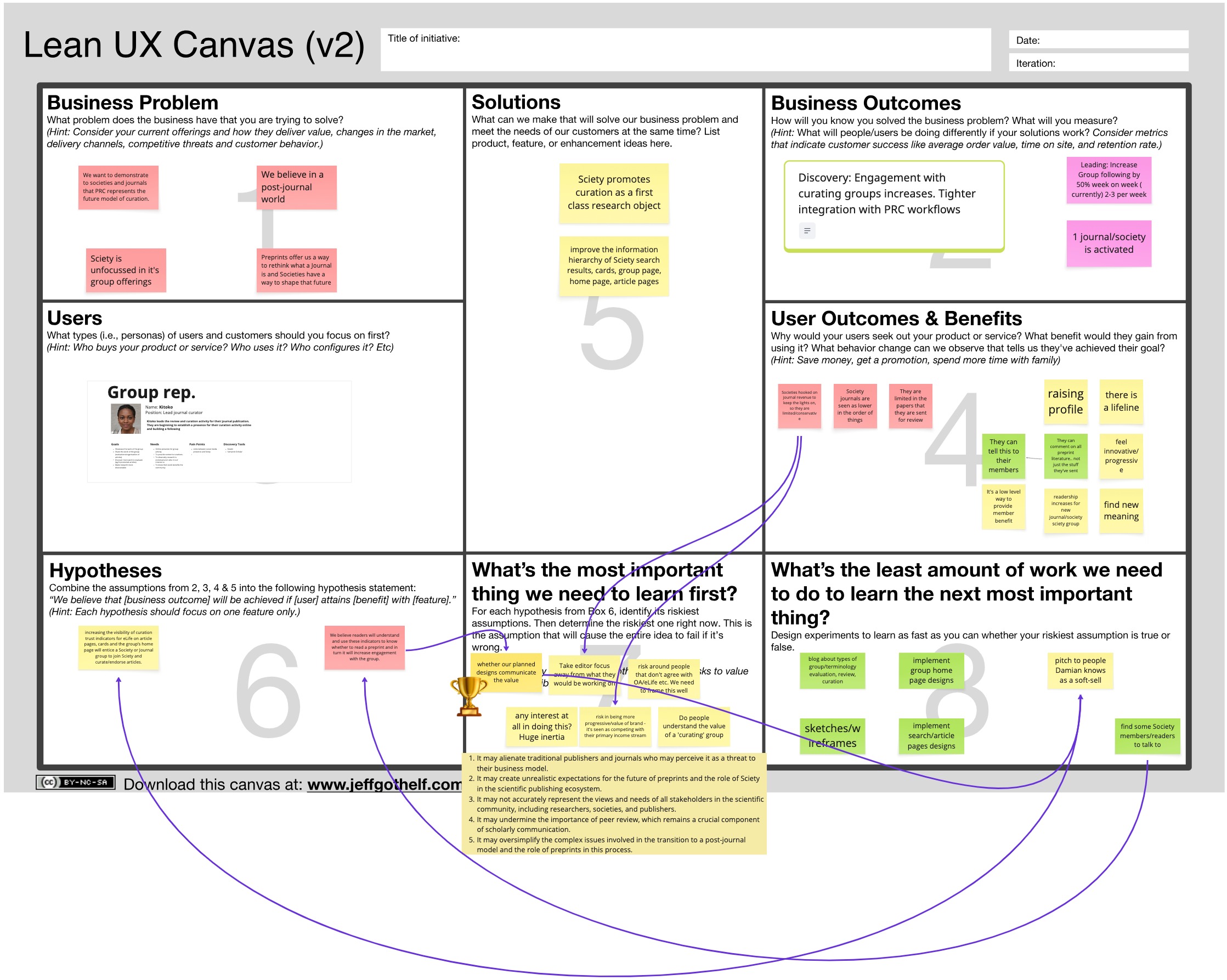
What’s the Lean UX Canvas?
The Lean UX Canvas is a tool developed by Jeff Gothelf. It’s designed to help product teams and stakeholders align on:
- What problem we’re actually trying to solve
- Who we’re solving it for
- What risky assumptions we’re making
- And what’s the smallest thing we can do to test those assumptions
It’s useful when:
- You’re working on something ambiguous or new
- Stakeholders are pushing for big changes without evidence
- You need to refocus the conversation around outcomes, not solutions
I like it because it keeps things grounded and creates a shared space to think through ideas without jumping straight to wireframes or solution delivery.
How we used Lean UX Canvas at Sciety
I ran a short working session with the myself and the stakeholders. Together, we filled in the Lean UX Canvas — starting with articulating what they felt was the business problem:
“Sciety appears unfocused in how it presents group offerings.”
That helped us frame the conversation around clarity for group representatives — the people running communities who want to showcase their evaluations on Sciety.
We then mapped out:
- Business Outcomes: More engagement from curating groups; better integration with PRC (Publish, Review, Curate) workflows.
- User Benefits: Groups could raise their profile, signal their values, and connect with a broader ecosystem.
But the key part was this: when we looked at our assumptions, we realised that the biggest risk wasn’t about visuals or design — it was that the messaging wasn’t resonating.
The smallest slice: a simple language change
Instead of jumping straight into a full redesign, we tested a small language change on the homepage and group pages. The idea was to make the group presence more prominent and purposeful — to better reflect their role in the platform.
This helped us learn quickly whether positioning was the issue, without committing to a full overhaul.
The result?
- The stakeholder felt heard and involved.
- The engineers had a clear, bounded task.
- We avoided spinning cycles on a redesign that might not have addressed the real problem.
Over time, we did implement many of the visual changes the stakeholder had in mind — but we did it with more confidence, and alongside other ideas we’d validated through user feedback.
Why Lean UX Canvas worked for us
For me, the Lean UX Canvas is most useful when:
- Design ideas are in someones head, feel vague or too big to start on
- There’s tension between vision and delivery
- We need to find the lowest-cost way to learn, not just build
As with much of product work, it is messy and there are probably many other approaches for this task, but creating a shared understanding is the most important thing to create a flow of value and the Lean UX Canvas worked for us at this time in this context